Latest Entries »

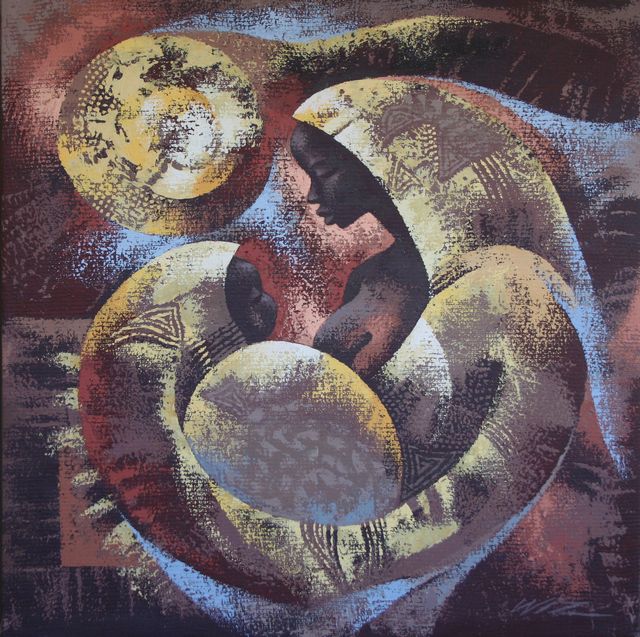
I chose the African piece Love Cocoon by Wiz Kudowor.  I couldn’t find the date for this piece.  Kudowor is a contemporary artist from Ghana.  He studied at the College of Art , University of Science and Technology in Ghana where he graduated with a degree in fine art.  Many of his pieces are displayed around Ghana, including a mural at Kwame Nkrumah Memorial Park (source). 

 Love Cocoon depicts a mother tightly holding a child.  I like this picture because it is very serene.  There is just a sense of peace that comes from this painting, in the color palette and the eased, happy face of the baby.  I also like how there is a globe in what looks like an elongation of the mother’s arm.  The globe likely represents the world— the mother is holding the whole world in her arms along with the baby.  I also think the general shape of the mother-baby complex makes a heart-like shape—just another way to represent all the love in this photograph.

 I like looking at African art, a lot of it is colorful and bright.  I like that African artists incorporate a lot of nature in all their artwork.  I also like how African art is so different than styles from Europe and the United States.  It is easy to see that African art developed independently into something new, unique but still equally beautiful. 

Kudowor says he had a difficult time painting outside of the African art confines, such as ritualistic paintings, until he was able to view art pieces from other places in the world.  He then learned how to paint as a human being first and an African second (source).  This separation, likely, is what makes his pieces so popular around the world because, as much as we may try to deny it, European art and art from the United States has impacted us our whole lives.  Even if we do not know anything about art pieces or art history, there are still paintings that we could list without even trying; the Mona Lisa, The Last Supper, Starry Night, etc.  These paintings have, subconsciously, made an impact to how we define art and it takes a lot of trying and understanding to fully appreciate artwork atypical to our culture.

I chose a piece by Huang Quan entitled Rare Fowl. It was painted sometime between 907 and 960 during the age of Five Dynasties (I was unable to find a definite date on the piece).  This piece depicts 10 fowls, 2 turtles and 12 insects.  Originally created without color by Quan, It was likely created simply as a way for Quan to teach his son how to paint, but has become a very popular example of bird and flower painting (source). Quan’s paintings are so detailed and realistic that a story is told in which Quan’s paintings of six cranes on a palace wall attracted live cranes who dwelled by the wall confusing the drawings for some of their own (source). 

Bird and flower painting is a form of Chinese painting that grew most during the Song Dynasty, thanks to Huang Quan’s son Huang Jucai that made the bird and flower style the standard style of the Song court in Bianliang (source).  It originally began as a way to decorate things, such as ceramic work and used for phoenix paintings on silk during the Warring States Period but developed into a very intellectual pursuit, eventually inspiring the creation of schools that solely studied the bird and flower painting technique. 

I like the style of bird and flower paintings because I am very interested in nature and the beauty in it.  Bird and flower paintings are just one way to show the beauty in the natural world.  I particularly liked this piece because it was simple and detailed.  It is easy to imagine the actual animals because it is so detailed.  I also like how this picture shows the diversity of birds.  I took an ornithology class and as much as I didn’t exactly appreciate learning 200+ Alaskan species, it did give me an appreciation for the diversity that exists in just one species.

My Idea of Evolution

Buddhists have a saying that the only thing that is constant is change.  Evolution is word that describes the slow change over time and is often associated with scientific evolution; however, everything can change and evolve over time.  I chose the theme of evolution and showed how paintings can depict change. 

The first painting I chose is old and used over and over again to “explain” the scientific theory of evolution.  I say “explain” because the principles behind the theory are much more complex and seeing this picture does not give someone full understanding of the concept behind it.  It was created before 1975 and it is hard to find the original piece and painter as it has been recreated time and time again.  I am sure you have all seen it, and I am only including it as a basis for the rest of the pieces.


The first painting I chose to analyze is a painting by Otto Rapp created in Canada in 1977, entitled Evolution.  Otto Rapp was born in Vienna Austria in 1944 where he taught himself to paint.  After many years of painting without instruction, Otto entered the University of Lethbridge, Alberta and graduated with a BFA. He has painted many pieces, most of which fall under the surrealist category.  Some of his inspirations are other surrealists, such as Salvadore Dali and Max Ernst (source).  His painting, Evolution, is a painting with the same general principle of the evolution of man, however, is depicted in a much different way.  I think it shows how men are expected to be at different time periods.  The biggest man in the picture is very muscular and buff while the smaller men are all in bowler hats and don’t appear to be anything special.  The buff man also reminds me of Arnold Schwarzenegger, another Austrian.  Is this a coincidence? Is this is painting a way to represent how the “ideal” man has changed from the business man to the body builder?  I’m not quite sure—this painting could have so many different meanings and that s one thing I like about this painting.  I also like the way the colors flow together in this picture, especially in the clouds and the detail is extravagant. 


The next painting I chose is entitled The Evolution of the Mouth by Herb Greene.  I could not find a set date on this painting, however, Greene’s paintings became popular during the 1980’s.  Greene taught architecture at the University of Oklahoma and wrote the book about artists and architects working together (source).   The painting has many details that look like mouths, but really aren’t.  In the upper left hand corner is an electron microscope image of what the artist describes as “an animal”.  I don’t know what animal, but it does look like human lips.  To ensure that the viewer can see lips, there is a pair of drawn lips close to the electron micrograph.  There are also other images in the painting that open and close as lips due, such as flowers and “the animal”.  This painting ties into my theme of evolution because it shows how one object can closely resemble another and how interrelated all the organic substances (animals and plants) are to each other.  The picture of the woman in the middle is inspired by Baroque paintings and is included because Greene paints different portraits of women inspired by different eras of paintings that he feels best fits in with the theme of the painting (source).   I like this painting because it’s interesting and unique and I like the idea of tying together all living things. 


The next painting is by Natalia Ouchakova and is entitled Evolution Iron.  I couldn’t find out much about this artist—she is a current Russian artist and so many of the websites that describe who she is and the meanings of her works are written in Russian.  However, Ouchakova paints many of her pieces with the idea of unity (source).  Her piece Evolution Iron depicts a woman with long hair; however, at the far left her hair is developing and even at one point the leaves form into parts of her hair.  I like how this picture shows the idea of the interconnections of nature and how one living being comes from another.   I wish I could find out more about why this artist created this piece and what it means to her, but alas, there is quite a language barrier. 


I chose the next piece called Bridge by Tibetan artist Zhang Ping in 2004.  The piece emphasizes how Tibet has been influenced by new people coming into it.  Ping says she tries to explain the influence that machinery and industrialization has had on the island.  The artist is trying to display both happiness and joy, with the bright colors and the joyful figures of, what I think are people who look like they are dancing and doing handstands.  However, she chose to represent the land in a body figure to show how important the land is to her and her people, yet others come in and enjoy it (Source).  She is painting about the difficulty of change as change is often difficult.  I chose this painting because I thought it was intriguing and very detailed oriented. 


The next piece is Evolution 2 by Ben Mangano created in Australia in 2008.  This is just one of the paintings of a series of paintings he developed that depicts a fictional landscape and how it changes over time, eventually developing from little indistinct objects to a group of what appear to be flowers by the 8th painting in the series.  Mangano has lived in Austrilia for 35 years and uses the crisp, contrasting colors of the landscape in his paintings.  He is an artist that taught himself with a few classes at the School of Art, Perth (source).  I chose this piece because it’s very up for interpretation and imaginative.  The objects in his paintings are not real objects, however, you can tell how they are developing over the series.  This shows how change and evolution can be recognized even in objects that aren’t recognizable. 

For my last piece I decided to tie art back in with art and focus on art’s evolution.  I chose a piece called Van Pablardo by a pretty unknown artist Vanessa Stark created in 2008.  Stark is an up and coming artist who was born and raised in Canada.  She paints many landscapes and is often influenced by nature (source). I chose this painting because it ties in many of the different styles of art we have covered in this class and throws them all together.  There is some of Van Gogh’s work in the background, of course the Mona Lisa and some cubism.  I like this piece because it is creative and very interesting. 

Since this is the first era were photographs were a large part of the visual arts, I decided to choose one of the artists that specialized in photography.  I chose various pictures by Walker Evans, a Farm Security Administration photographer.  Many of the pictures were named by people other than Walker Evans and many of the dates have been lost, therefore it is difficult to title his photographs.  However, the era in which the photographs were taken was during the Great Depression of the United States and, therefore, the photographs were taken somewhere in the late 1920’sand early 1930’s.  To solve this loss of identification of works, I chose to use the name of the photograph that others have given them or to refer to the photographs by just describing what is in them.   

The first picture I chose is called The Familiar Stranger and is named so because the psychologist Stanley Milgram used this picture to represent how two people can run into each other every day but not really pay attention to them.  His article further goes on to explain how different face-to-face interactions are than interactions on popular social networking sites (Source).  The article is called The Familiar Stranger: An Aspect of Urban Anonymity and, unfortunately UAF doesn’t have access to it through the library website, however, I am sure it would be an interesting read.  I think the ability for this photograph to be able to represent a modern day phenomenon such as social networking websites shows how this photograph can transcend through the ages despite the obvious characteristics that are outdated, like the black and white and the, erm, clothing “style”. 

Another picture I chose is a very popular picture of a girl named Allie Mae Burroughs.  This picture shows how desperate people in the Great Depression were as the woman, who was a mother, was working hard to keep her family fed in a desperate time.  The need in this woman’s eyes is indescribable which is likely why this picture became a symbol of the Great Depression.  There is also current controversy with this photograph as the son of Allie Mae Burroughs spoke to CNN in 2005 and discussed how his family never received compensation for taking care of Walker Evans and the journalist that worked with Evans, James Agee although without the Burroughs family Evans and Agee would be much less famous. (Source)

Evans was also good at capturing images that we can find in today’s society, such as the photograph below which contains not only an advertisement for coca-cola but the United States Postal Service.  It’s amazing how things change but we are able to recognize things from history, such as human emotions and interactions and popular items.  I think it’s strange that I do not like pieces of art that deal with history but I am attracted to photographs that depict the same thing in, often, a more realistic manner.   

http://www.vestaldesign.com/blog/2006/09/art-psychology-the-familiar-stranger/

http://money.cnn.com/magazines/fortune/fortune_archive/2005/09/19/8272885/index.htm

http://xroads.virginia.edu/~ug97/fsa/str.html

I think Impressionism was a very important era in the development of  modern art.  Many of the pieces of art that we viewed before Impressionism seemed very similar and Impressionism was the beginning of a different kind of art.   With Impressionisms new techniques, new subject matter and the loss of previous standard subjects (such as religion and history) made Impressionism much different.  This big difference between Impressionism and previous works of art was definitely felt in people’s original reaction against Impressionism—we never accept what we don’t understand and Impressionism was a whole new kind of art to understand.

I like Impressionism.  I am a color person and many of the Impressionist pieces were all about color and it explodes off the page and makes the painting look happy, bright and beautiful!  I also like paintings of the outdoors that are less concentrated on people and more concentrated on natural beauty of the world.  I think Impressionists painters’ techniques of painting short brush stokes that were not smooth or evenly blended together brought out the natural beauty in the physical world (Source).  But not all the art styles we have looked at in this class are quite as appealing to me.  One of the pervious art styles that I did not appreciate included neoclassical style as the colors in those paintings were more dark and drab than those in Impressionist paintings. 

An example of a neoclassical painting that I am not very fond of because the lack of color, linear, somber characteristics and the, to me, uninteresting topic was by Jacques Louis David and is entitled Oath of the Horatti (1784, Paris).I just find that I am unable to connect with this piece and feel as if it might just be too masculine to appeal to me. 

Another piece of neoclassical art that I did not really like is called Death of General Wolfe (1771, London) by Benjamin West.  This painting doesn’t mean very much to me as the colors are dark and the topic is just depressing—the death of a fellow who was likely very respected as many people in different attire are surrounding him in his time of peril.   I think if I were more of a history buff, I would definitely care more for this photo, however, I don’t find it at all appealing. 

But not all neoclassical paintings were unattractive to me.  I liked Cornelia Pointing to Her Children as Her Treasures (1785, London) by Angelica Kauffman as the scene of the painting was happier and brighter than other neoclassical paintings and had a topic that I thought was interesting: an everyday mother just taking care of her children.   I also like the history of piece as the woman in white (who is Cornelia) is listening to the woman in red who is telling Cornelia all about the great stuff that her husband brought back to her from all his travels.  All Cornelia has to show as far as treasures go is her children—but that is more than enough as Cornelia has neither shame nor resentment on her face but rather a look of joy.  The color of Cornelia’s dress also further emphasizes Cornelia’s purity and innocence as she is not concerned about materialistic objects from her husband but more concerned with her family.  This fits in neoclassical paintings as many of them told morals and, obviously, materialism was frowned upon in this era (and hopefully after this era).  (Source)

Therefore, there are pieces of art in each era did and did not appeal to me even though they are in the same era.  Impressionism, however, had fewer pieces that I did not like and more pieces that I did.  Some of my favorite pieces were painted by Claude Monet and include Poppies Blooming (1873, Paris) and his multiple paintings of his home garden in Giverny where various paintings of the bridge and pond in his garden are painted (Source).  One of my favorite from his many at Giverny is titled Bridge over a Pond of Water Lilies (1899, Giverny).  I like these painting because of the peace and serenity that are found in them.  They look like places that I would like to relax and just enjoy the beauty of the world.  They are simple, subtle, colorful and beautiful. 

 I also like John Singer Sargent’s Carnation, Lily, Lily, Rose (1885, London) because of the intricate detail and the dream-like feel of the piece.  There are many other great pieces from the Impressionist era and although my analysis was brief, there can only be so many ways to say Impressionist art is magnificently beautiful.  

I rarely think about music.  When I listen to music I usually don’t pay much attention to it so it is difficult for me to analyze.  I chose Wolfgang Amadeus Mozart’s Piano Sonata No. 11 which is often referred to as Alla Turca, Turkish Rondo, Turkish March or even Rondo Alla Turca.   It is not certain where or when Mozart created this piece, but it is likely that he composed it in Vienna or Salzburg between 1778 and 1783. 

The Piano Sonata No. 11 is a sonata that has three movements. 

The first is called Andante grazioso which had six variations, or six sections that are repeated multiple times with slight changes in either the harmony, melody, counterpoint, rhythm, orchestration or even a combination of some of these.  Variation is a technique in which simple variations are created before more elaborate ones were entered.  This is different than previous styles of music and allowed the audience to adjust to a piece and, therefore, made it more enjoyable and accessible to a wider variety of audiences.  (Source)  In our assignment this first movement was referred to as the exposition. 

The second movement is called Menuetto which was made of a minuet and trio.  A minuet and trio is named after a social French dance and involves a series of quarter notes, often in ¾ time which means that there are 3 quarter notes in a measure. (Source)   In our assignment this movement was referred as the development section of a sonata. 

The third movement is the most famous movement of this piece and explains why there are so many different names for this piece.  It is called Alla Turca: Allegretto.  It is often played by itself and was inspired by the Turkish Janissary bands which were very popular during Mozart’s time.  (Source)  In our assignment this movement was considered the recapitulation. 

Mozart wrote over 600 pieces which varied from chamber to symphonic to operatic and choral music.  Many of Mozart’s works are well known, especially his operas which were comical and dramatic.  Some may consider his greatest masterpieces to include Piano Concerto No. 24 and the Symphony No. 40, with his opera Don Giovanni, but with over 600 works it’s hard to choose just one great work.   I chose it because it was fast paced, yet still easy going and relaxing.  I like that there wasn’t much complexity in the piece and it is possible to take the piece at face value and say that it is a good piece even without being well experienced in music.  The music of the classical era, in fact, was made in a way to make music clearer and place more emphasis on melodic expression and instrumental variety. (Source)  This made music accessible to more common, less musically educated people; including me. 

There were many varieties of performances to choose from for this song.  I decided to include a few of all different kinds of musical platforms and musicians.  The first is a very talented group and the longest clip I could find as if the piece were to be played in full it would take 24 minutes.  (Source)  The second video clip I included because the performers finger agility is amazing!  The third video clip I included because it shows how art forms overlap as an amazing tap dancer dances with the orchestra playing Piano Symphony No. 11.

Sources:

http://en.wikipedia.org/wiki/Variation_form

http://en.wikipedia.org/wiki/Minuet

http://en.wikipedia.org/wiki/Piano_Sonata_No._11_(Mozart)

http://library.thinkquest.org/15413/history/history-cla.htm


Are you in or out?


The more that visual art I look at, the more I realize that I am drawn to complex, detail orientated paintings.  Therefore, it is not a surprise to me that the piece that I chose to analyze this round is a genre painting titled Las Meninas by Diego Velazquez between the years 1656-1657 in Madrid. 

The title Las Meninas can be translated as: The Maids of Honor.  Since the painting is a genre painting, it represents a scene of everyday life of the artists’ subject (Source).  The only question here is, who is the artists’ subject?

The first person I pick as the main character of this painting is the little girl in the middle.  I say this because she is simply closest to the center of the photograph. Other reasons I think she is the subject of this piece is because of the lighting.  The technique of theatrical tenebrism, in which the main subject of the piece is illuminated against a darker background, was widely used during the Baroque era (Source); as the little girl is much brighter than other areas of the painting I believe theatrical tenebrism is being used to portray her importance in the painting.  I found the name of the child to be Infanta Margarita, later to be known as Margarita Theresa of Spain, who was the daughter of the King and Queen of Spain.  She, despite her apparent young age, is betrothed to get married to her maternal uncle and paternal cousin Leopold I, the Holy Roman Emperor in order to maintain her position of the throne and pass her throne to her descendents.  They would marry in 1666, so about 10 years after this painting was completed when Margarita Theresa was the prime age of 15 (source). 

However, Margarita Theresa of Spain may not be the center of this painting as the painting is titled Las Meninas which, once again, means The Maids of Honor.  This makes me wonder what the roles of the maids of honor are in this picture.  They could be a way to confirm Infanta’s royalty as one is curtsying and the other is tending to her, which further makes Infanta appear to be the main focus of this painting. 

There might also be another main subject of this painting: the audience.  I think this because many of the people in the painting are looking out of the picture, including Infanta herself.  There is a mirror behind Infanta Margarita in which two people can be seen.  These two people are Infanta Margarita’s parents, the King and Queen of Spain.  Since many people in the picture are looking at the painting as if they are looking at the people viewing the painting, this might be a suggestion that the viewer is equal to royalty (source). The development of the middle class In the Baroque era allowed paintings and other types of artwork become available to more than just churches and monarchy (source).  This may explain the direction of the gaze of the characters towards the audience, a way to represent that whoever is viewing this painting is now synonymous with royalty.  Another way in which the audience feels as if they are part of the painting is the artist in the painting with a brush and palette.  This artist is Velazquez himself and he appears to be painting yours truly—or is he painting the King and Queen?

This painting appeals to me because of all the fine details.  I can imagine the feeling of the clothes by the intricate details, the feel of the dog’s fine hair, the soft, light hair of the girls; all these details are so well displayed it really does make the audience feel as if they could just jump into the picture.  I also like the ambiguity of the painting—it could mean many different things to many different people and different people will appeal to different characters depicted in the painting.  There is definitely far more to be analyzed in this painting.  It is no surprise to me that this painting has been considered one of the most widely analyzed works in western painting history (source).

In many of Pieter Bruegel’s paintings he paints people, but not in a very pleasing manner.  For example in Madrid in 1562 Bruegel painted The Triumph of Death (below, or can click here for a larger picture) in which unpleasant actions of humans such as war, death and killing are portrayed against a dreary backdrop.   Many of Bruegel’s works contain such depressing ideas as are present in this painting and, therefore, I think many of his works were based on the reformation of the church as these paintings depict ideas that are not religiously moral. In fact, his paintings have been described to show human weaknesses (source).  This is not similar to the works  of previous artists of the period in which humans were displayed as beautiful beings without emphasis on the faults and weaknesses of humanity.

Bruegel -- 1562 -- Madrid

The Triumph of Death is not the only piece of art in which strong, negative images are found, another such piece is Two Monkeys, also called Two Small Monkey in some literature, which was painted in Berlin in 1562 and this is the piece I chose to analyze, although many of his art pieces are very intriguing.

Bruegel -- 1562 -- Berlin


Everyone has heard the tale of evolution which has often been simply summed up as humans are derived from monkeys.  In Bruegel’s painting Two Monkeys, I think he uses the monkeys as substitutes for humans.  I interpret the meaning of Two Monkeys as a metaphor for addictions.  In the lower right hand corner of the painting there is cracked, empty nutshell.  These monkeys could have given up their freedom for one single nut.  This has been supported by other interpretations of this piece in which the Netherlands proverb, “to go to court for the sake of a hazelnut” has been applied to this piece (source).   This is often as addictions go: people will do anything to obtain their desires, no matter how small.  The small arch also gives the painting a feeling of confinement, as if the monkeys are trapped.  In many addictions, the addict feels as if they are trapped and cannot live without whatever they are addicted to.  I think the beautiful, happy background is supposed to represent the life that the monkeys could have if they were free from this addiction.  The monkey on the right is looking away, as if he is ashamed or possibly abused by the other monkey.  The sadness in this picture is almost overwhelming.  It can be seen in the eyes of the monkey, the hanging heads, the dark colors inside the arch, the empty shell; all these features give the painting a sense of sadness and desperation.

Since many of Bruegel’s paintings contain humans, it makes me wonder why he didn’t paint humans in place of monkeys.  My hypothesis of why he used monkeys is because monkeys are neutral to all people.  By this I mean people have hair color, people have similar shapes— basically, people look like people. Therefore, if someone believed they looked like the person depicted they might see more of themselves in the picture than people who did not look like the individual in the painting.  For example, if the monkeys were replaced with men I would be able to connect less with this picture as I know it could not be me because I am not a male.  However, by using monkeys they could represent anyone, any gender, any race as addictions are found all kinds of people. 

I chose this piece because of the raw emotion that can be seen in it.  Little interpretation is needed to see that there is sadness in this portrait. I chose it for the detail, the contrast between the dark arch and the light background, the emotion of the monkey, all the little details that make Bruegel’s paintings so marvelous can be found in this piece. I also chose it because I found meaning in it that is  just as relevant yesterday, today as it will be tomorrow.

Hello world!

Welcome to WordPress.com. This is your first post. Edit or delete it and start blogging!

Design a site like this with WordPress.com
Get started